CARP PROJECT
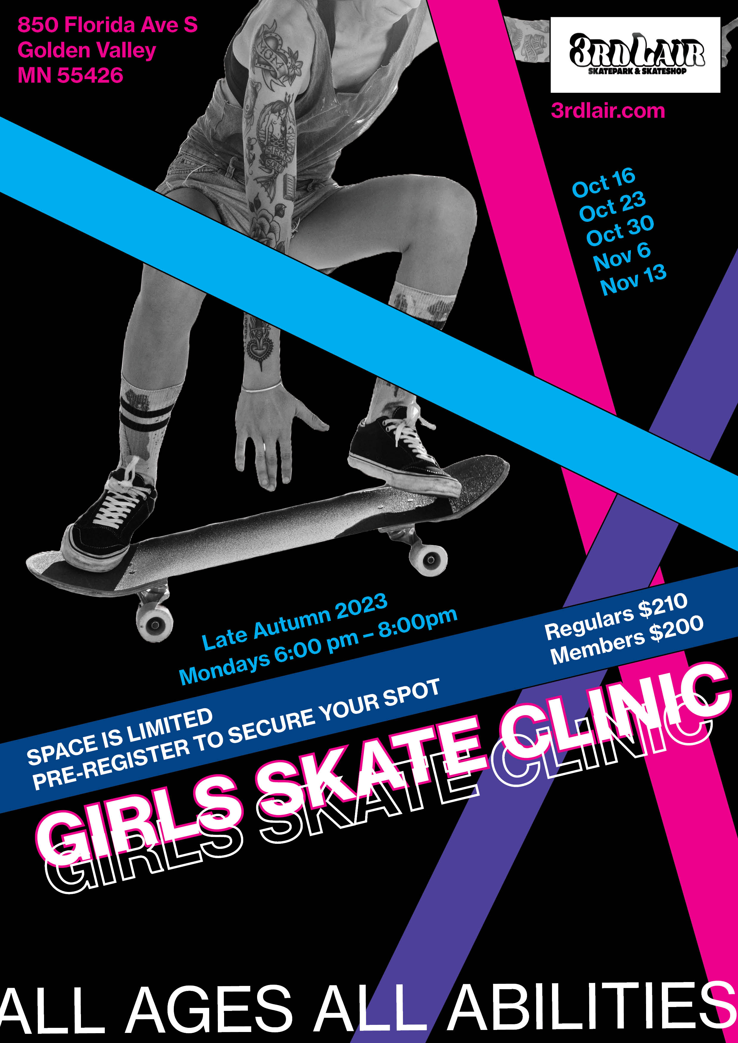
FIRST ITERATION
Making this poster helped me familiarise myself with the Adobe workspace and InDesign, and I learned to do some basic image effects. I used contrasting colours to draw attention to the title and make it the place someone's eyes will go to first. I used a thick line as a repetitive element and aligned my text along the lines to make the poster look more dynamic. I used a colour scheme of pink, purple and blue to cater to my targeted group and unify my design.
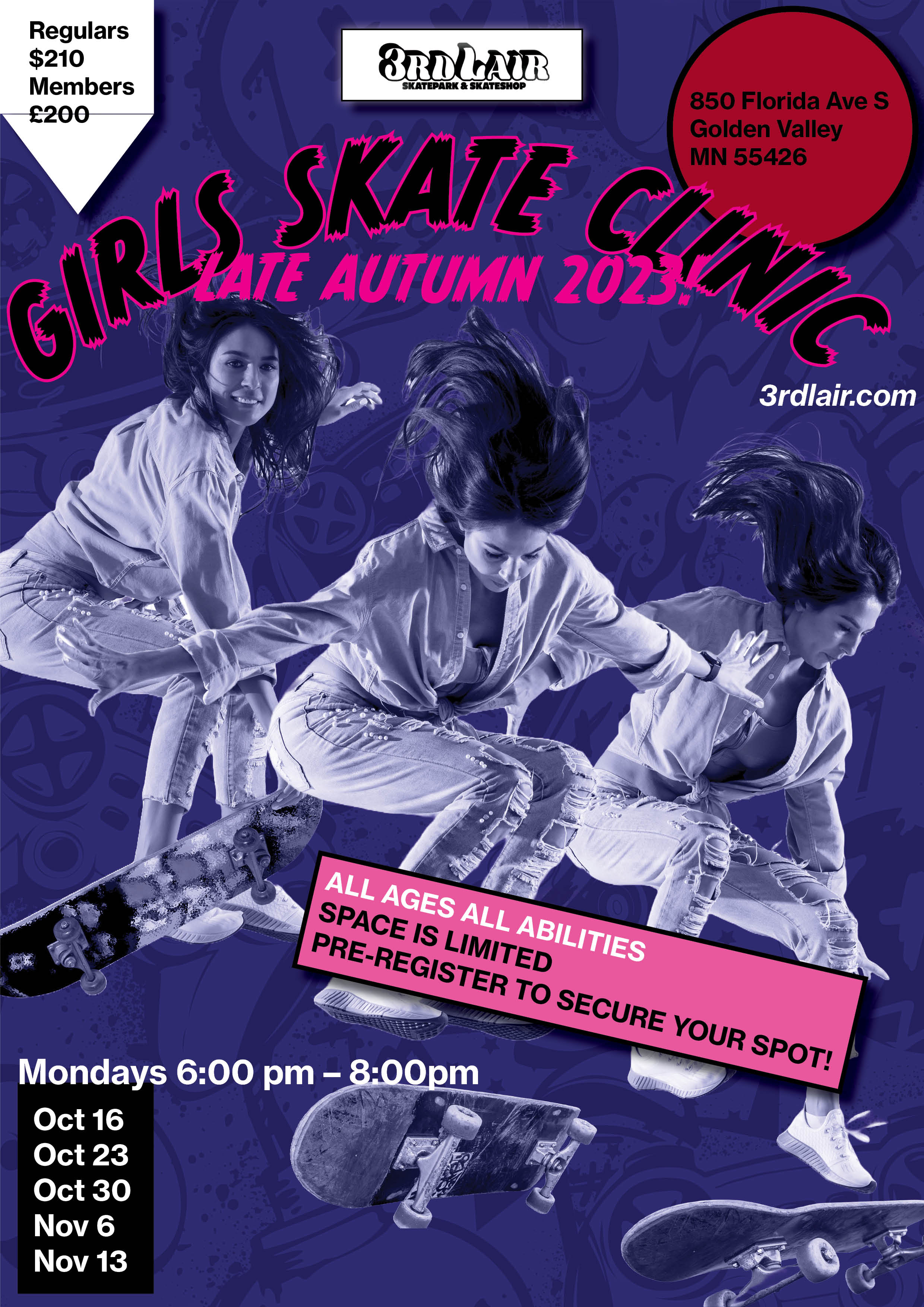
SECOND ITERATION
In this poster I used a similar color scheme. I used a comic style typeface to convey an energic and fun mood. However, I could have used contrast better, since it is not clear what the most important information is. The eyes are drawn to the white shapes at the top of the poster. I did not use the same alignment throughout the poster.
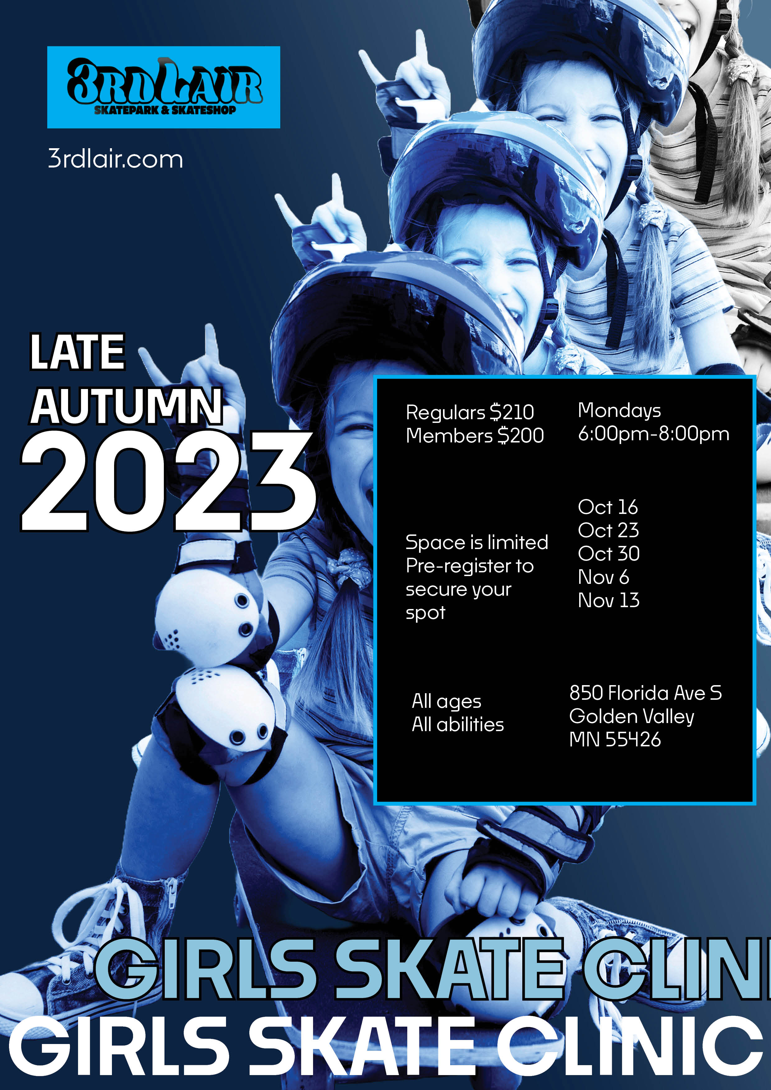
THIRD ITERATION
To adhere to repetition I used the same typeface throughout, and the same colour. I used bold white text for the 'GIRLS SKATE CLINIC' and 'LATE AUTUMN 2023' to create contrast between the text and background, draw attention to them, differentiate them from less important information. I used proximity when grouping the less important information in the black box.
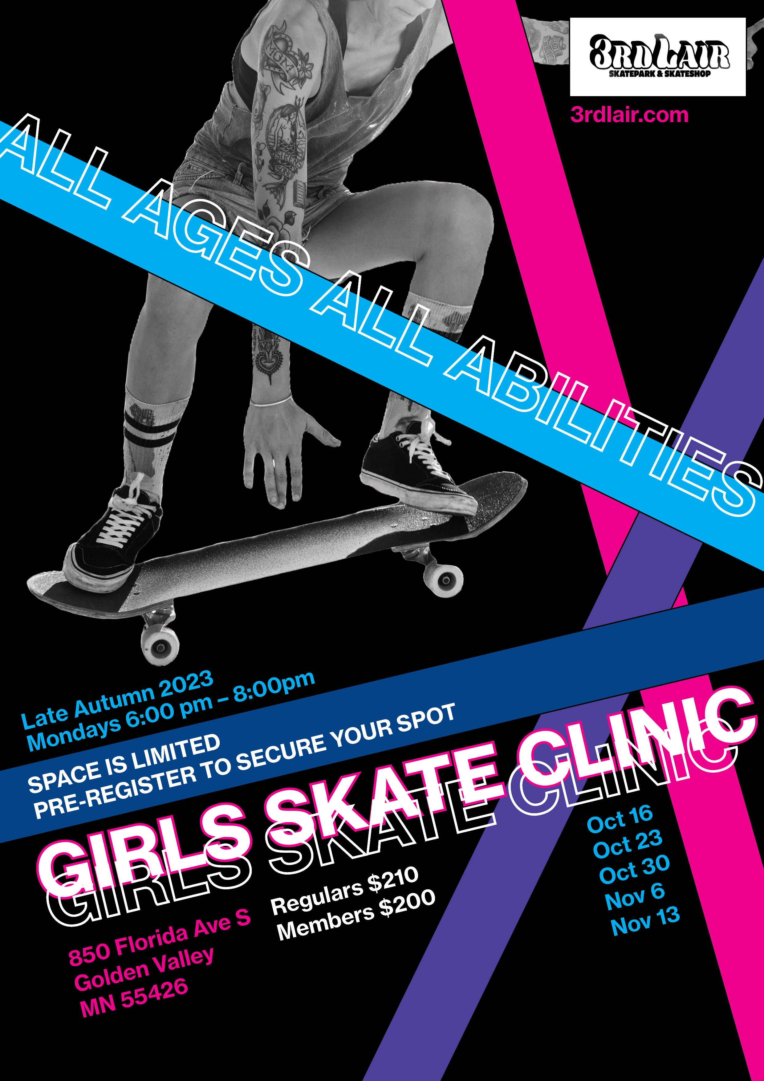
FINAL PIECE
For my final piece I used my first iteration and made some minor changes. To adhere to proximity better, I moved the text around to create two clear groups of information. To adhere to alignment better, I aligned this text to the lines.
TYPOGRAPHY PROJECT
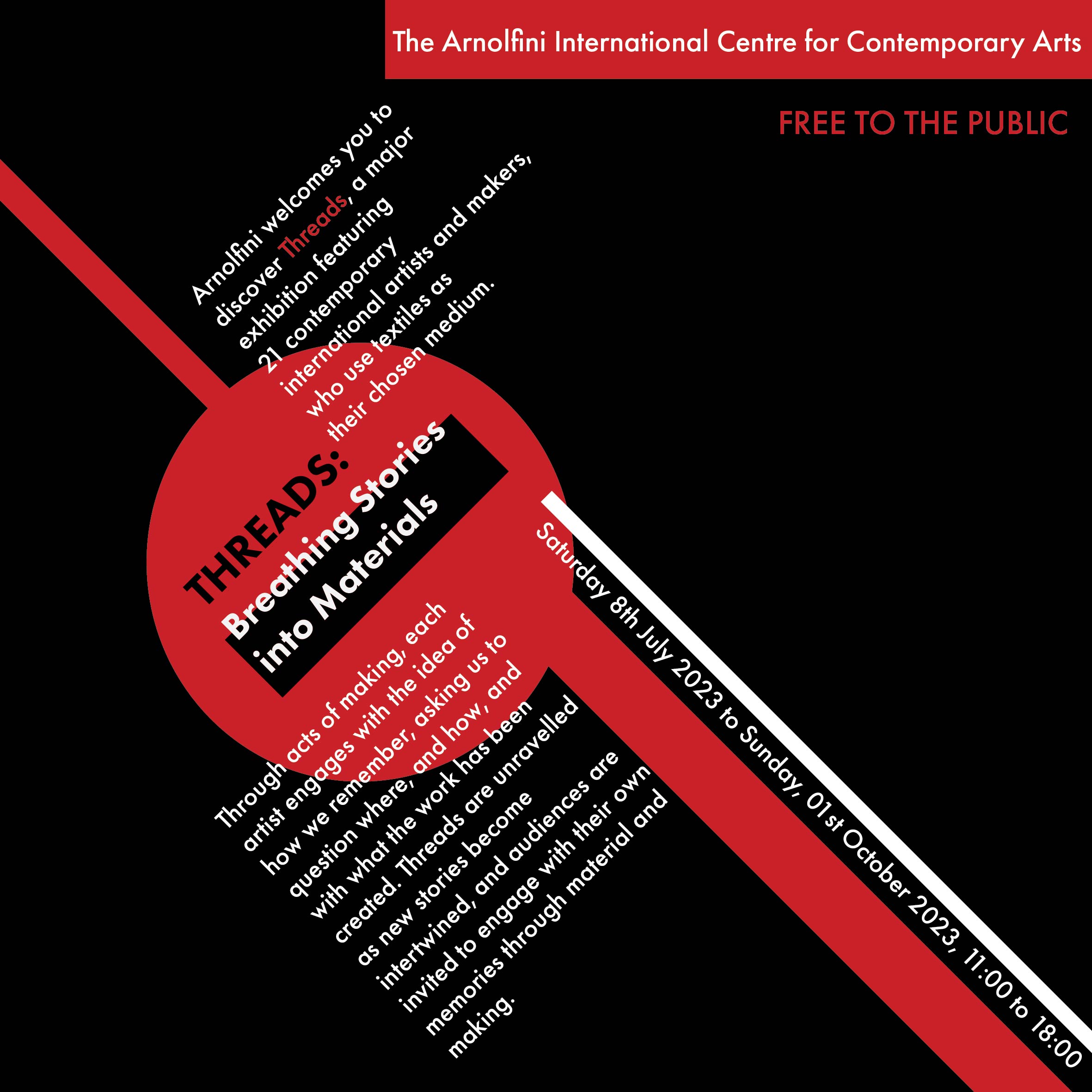
AXIAL TYPOGRAPHIC SYSTEM
In an axial design the elements are on an axis. I achieved this by aligning text parallel and perpendicular to the lines.
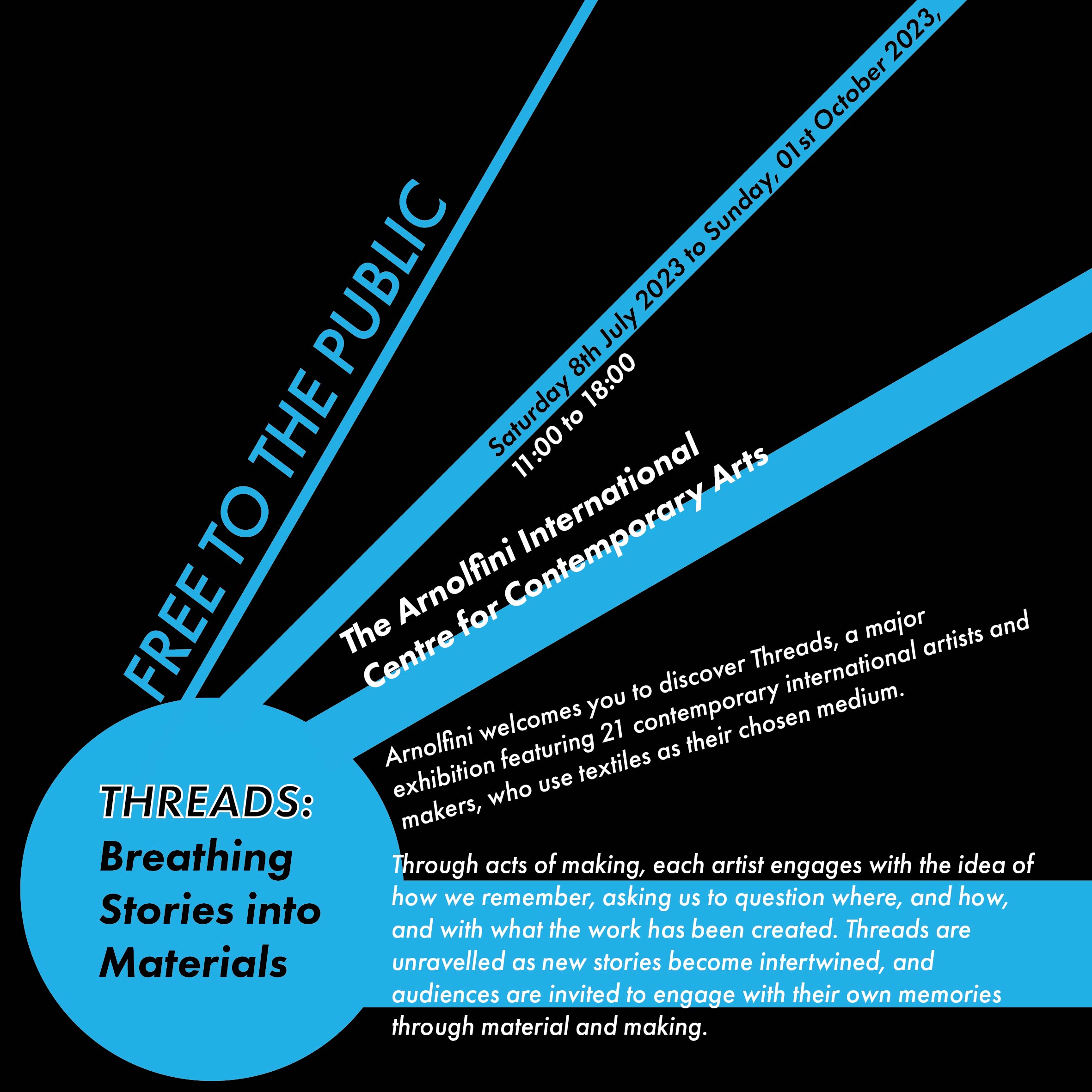
RADIAL TYPOGRAPHIC SYSTEM
In a radial design, all of the content radiates from a central focal point. I set my text around a circle.
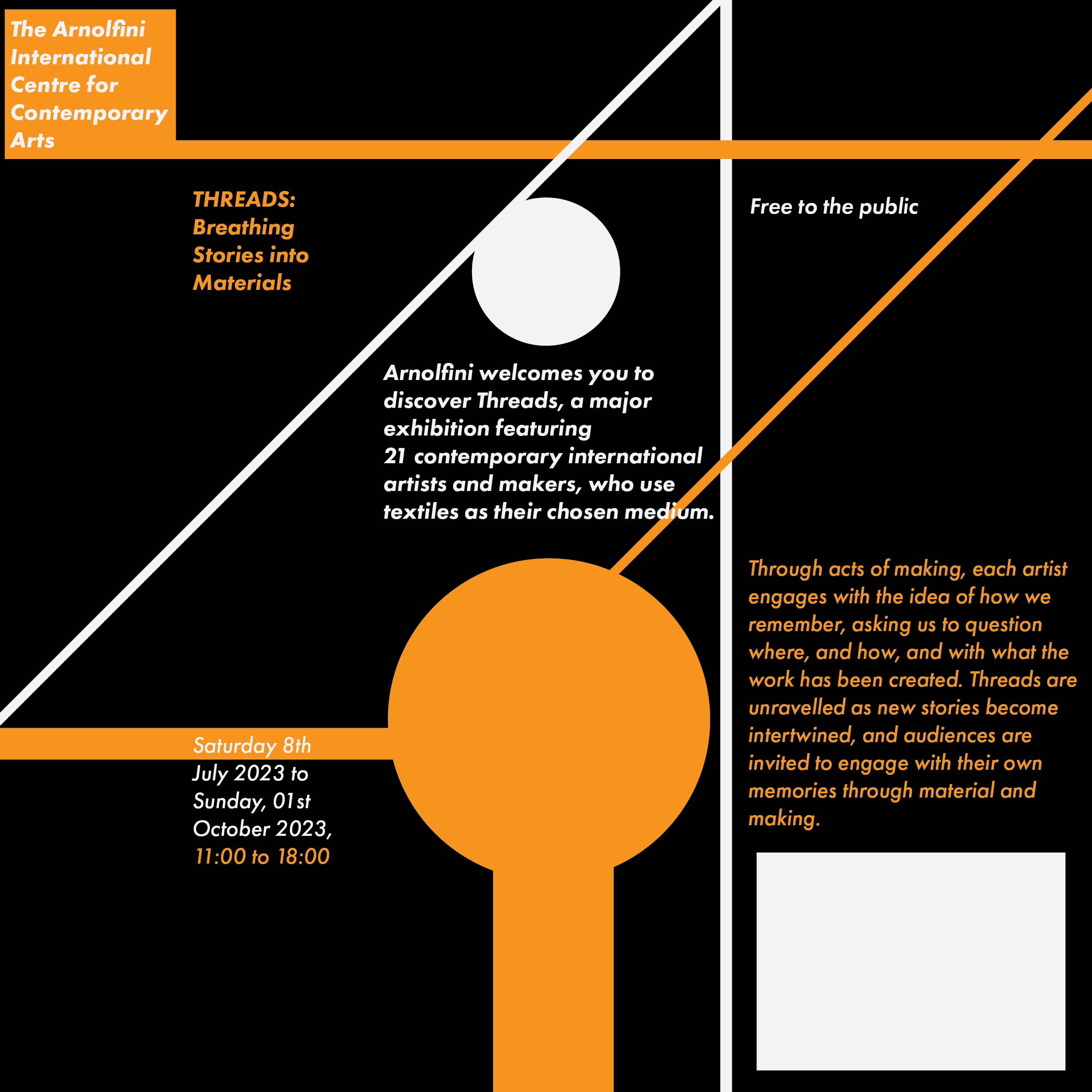
GRID TYPOGRAPHIC SYSTEM
In a grid design, all the text and graphics fit neatly into columns and rows. I created this piece by using the grid tool and aligning my elements inside it.
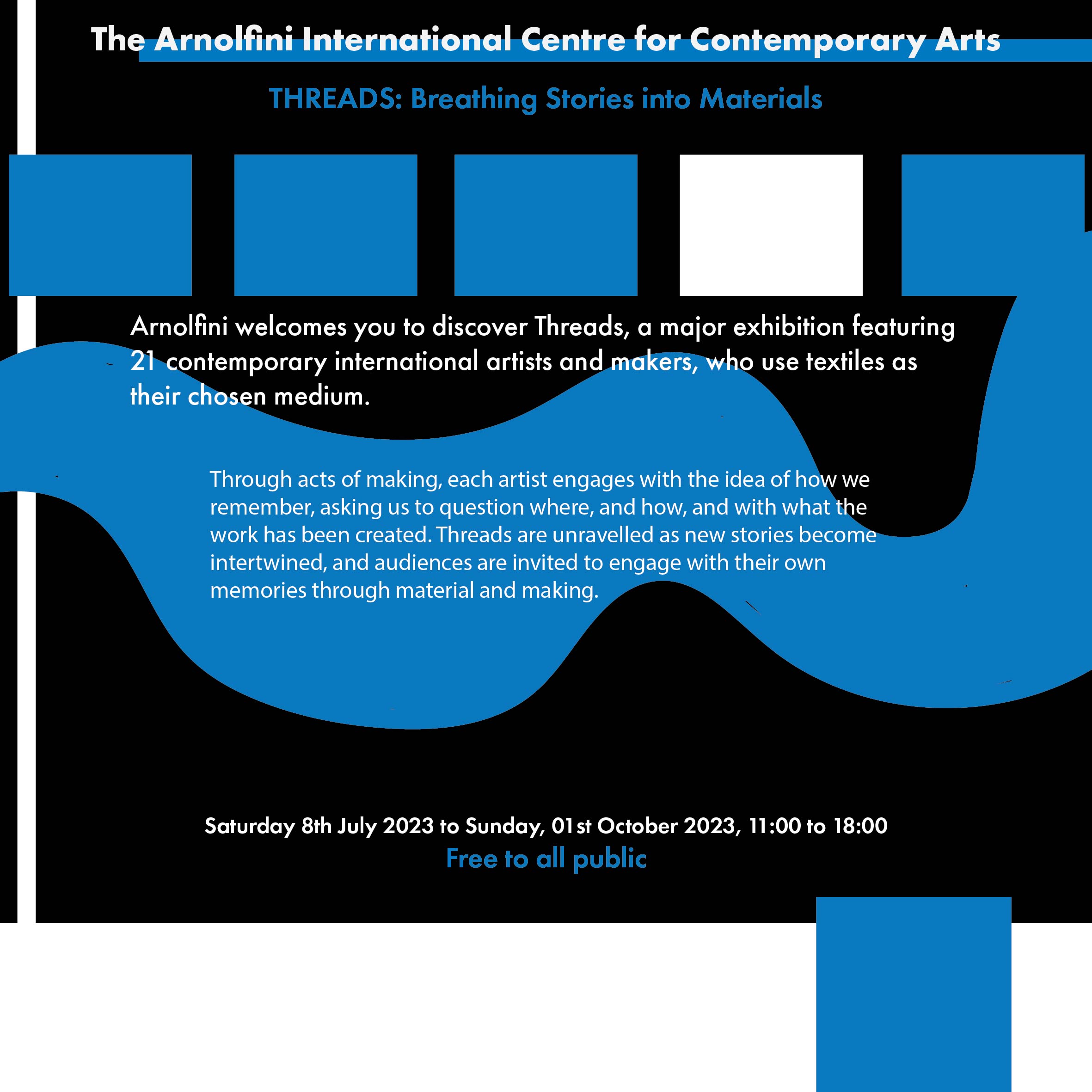
BILATERAL TYPOGRAPHIC SYSTEM
The text is centered and more symmetrical than the other typographic systems. I used geometric and organic shapes to balance out the regularity of the text.
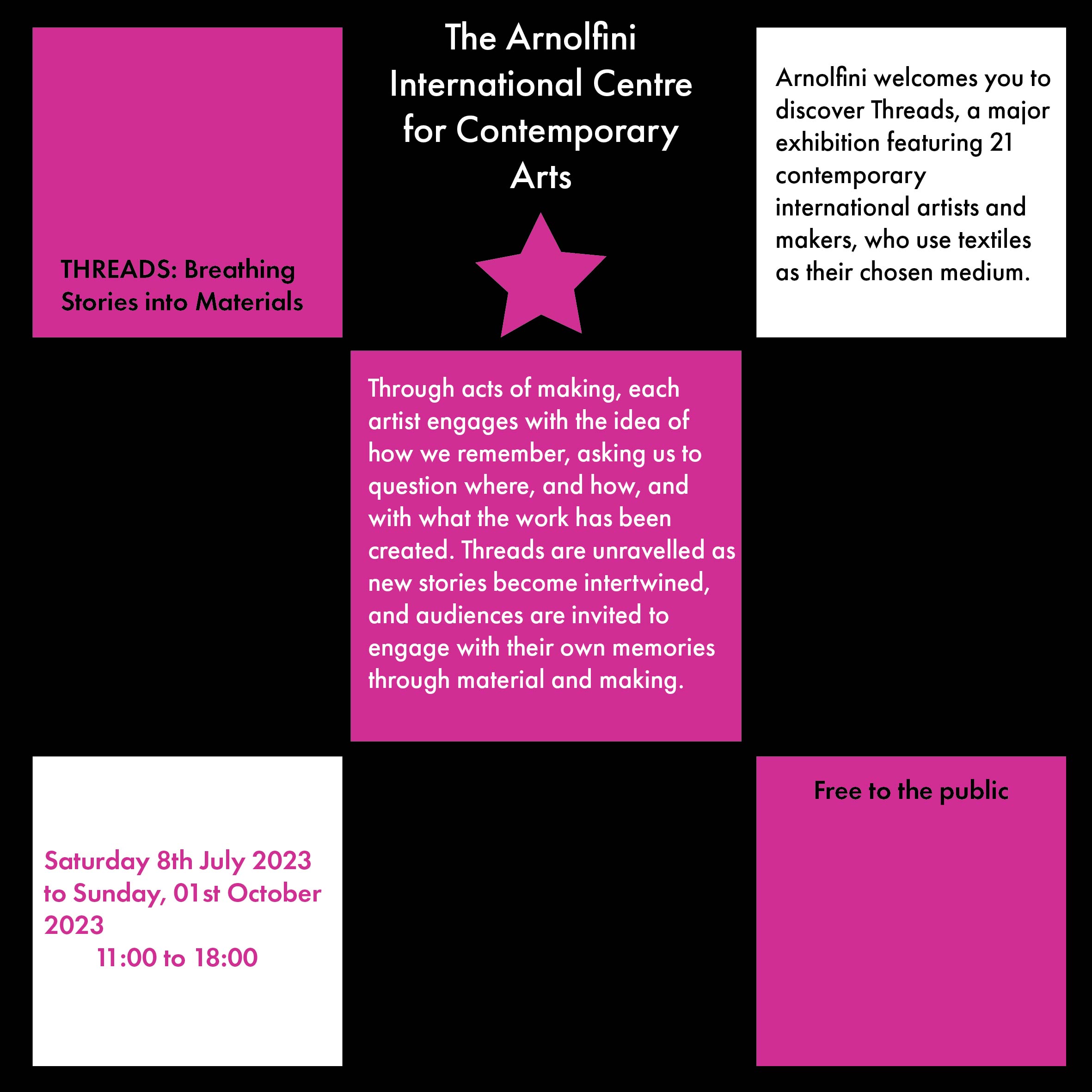
MODULAR TYPOGRAPHIC SYSTEM
A modular design is made up of mini compositions that come together to make a larger composition. The squares are a repeatable structure in my poster to hold content.
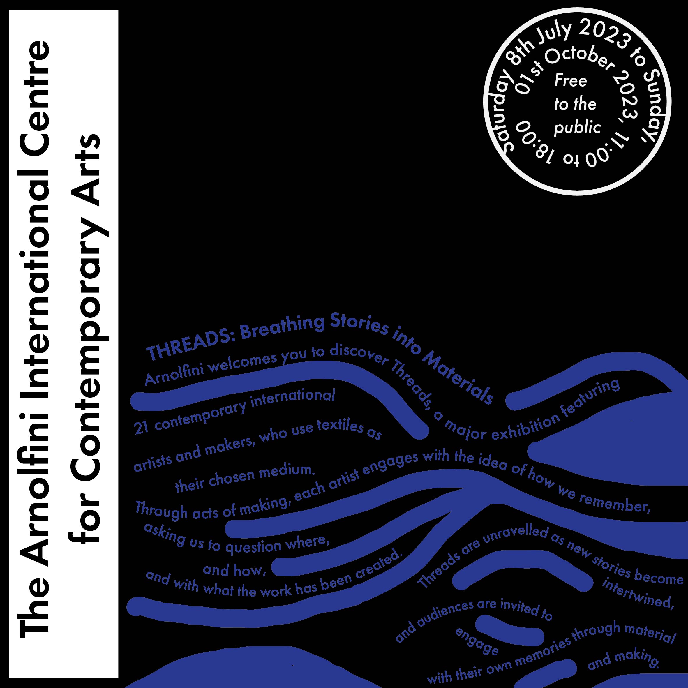
TRANSITIONAL TYPOGRAPHIC SYTEM
Transitional designs use layers of text that are compared to layers of sediment and stone. The text seems to have movement and direction, and I implemented this idea by arranging text so it looks like a body of water.
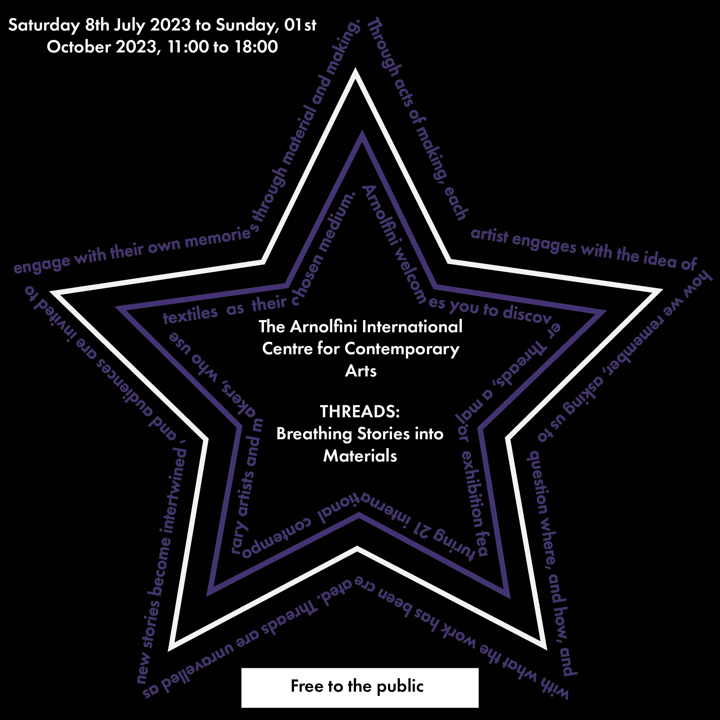
RANDOM TYPOGRAPHIC SYSTEM
In a random design the elements are organised randomly and it does not fit the same pattern as the other typographic systems. I implemented this by arranging my text in the shape of a star.
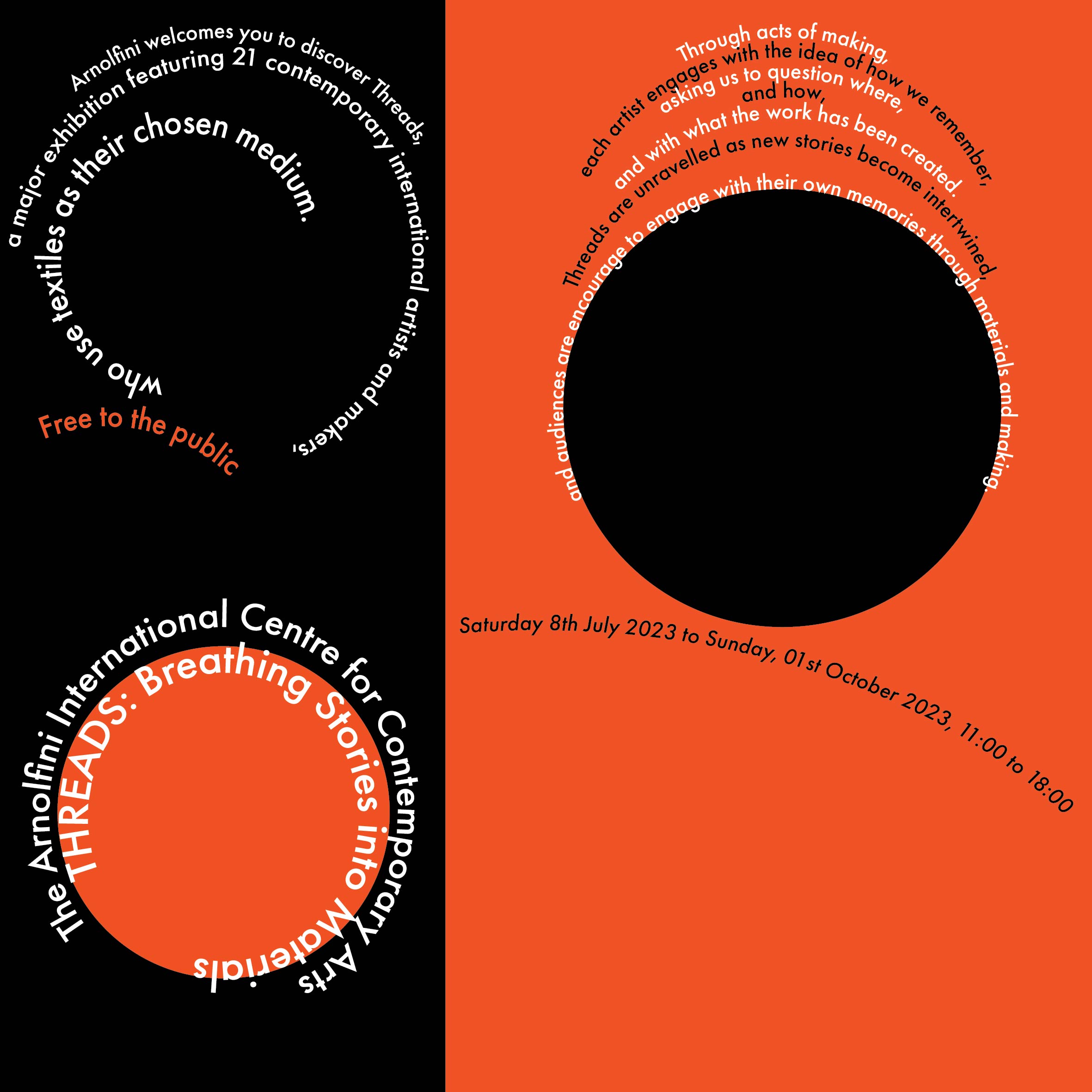
DILATATIONAL TYPOGRAPHIC SYSTEM
In a dilatational design, type is set along circular paths. I used multiple circles, varied the centers of the circles, and made them different sizes.
CODING WORKSHEETS
Visit my Github page.I started with no knowledge of coding a website, and now I have some basic HTML and CSS skills.
Doing these coding worksheets helped me learn and practice using Github, including making repositories, and committing/pushing.
I learned how to make a basic webpage including text, images, videos and links.
I was introduced to flexbox and learned how to flex different elements of a website.
I learned how to make some basic buttons, styled them using CSS, and made them functional using anchor links.
REFLECTION REPORT
This assignment is my first experience with HTML and CSS, and by building my first website I was introduced to many new concepts such as flexbox, different block level and inline elements, using class selectors, and setting up anchor links.
The first thing I did was use Miro (also for the first time) to wireframe my website. I was introduced to the basic elements of a web page, including the header, footer, navigation, the body and hero image. We learned how to use AI to help with coding, and I used ChatGPT for the foundation of my webpage. I enjoyed using CSS to explore how I can style elements in different ways, and personalise my website.
It was also my first experience with Github, which I found difficult to use in the beginning. I'm now fairly confident with concepts like pulling/committing/pushing, and setting up/using repositories.
I learned about the CARP principles of design and how to implement them when designing a poster. I found contrast and repetition easier to understand and implement than proximity and alignment.
I learned about CMYK and RGB colour, and how to export my images to use in my website. I did some research into posters made by graphic designers on Behance, and I was introduced to a few different styles. For example, I was inspired by Brutalism, which is strict and orderly, and often uses neo-grotesques.
It was my first time using Adobe InDesign and Photoshop and there was a steep learning curve. After creating three posters, I am now familiar with creating text, shapes, and editing graphics using these tools. The CARP assignment helped me become more comfortable with the Adobe workspace but I don't think my posters showed the CARP principles particularly well.
This semester I was also introduced to typography, and what fonts and typefaces are. It was interesting to learn that there are a vast variety of typefaces which have different styles, and can be used to convey different moods.
We learned about the 8 typographic systems and how to create them in our posters. I made a poster for each typographic system, and this was a challenge because some of the systems can have similar features, such as grid and modular. I used Adobe Illustrator for the first time but I found it easier than InDesign and Photoshop.
Overall, it was my first time using a variety of different tools and softwares. Before this semester, I knew nothing about design. I also feel like there is a lot more to know about InDesign and Photoshop, and I need more practise implementing the CARP principles in my work. If I had more time, I would do more research to improve my coding skills. There is still a lot I don't know about web design and after completing this assignment, I would like to explore HTML and CSS further.